Creating and Analyzing Maps
I learned how to visualize data geographically by creating different kinds of maps, which use varying shades of color to represent different data values across regions, helping to identify patterns and trends.
Welcome to my website filled with the maps I made these past few weeks with QGIS, ArcGIS, and more. I hope you enjoy what you see.
The following section will show every assignment we did during class, comprising of the maps and a little description of the process.

I learned how to visualize data geographically by creating different kinds of maps, which use varying shades of color to represent different data values across regions, helping to identify patterns and trends.
I gained some experience in integrating and using various data sources, and integrating them into different GIS engines.
frequently during assignments, something did not go according to plan. Therefore, I improved my problem-solving skills because I had to think outside the box.
the skills I gained during this course will be very helpful for my major (earth and environment), future master and possibly future job.
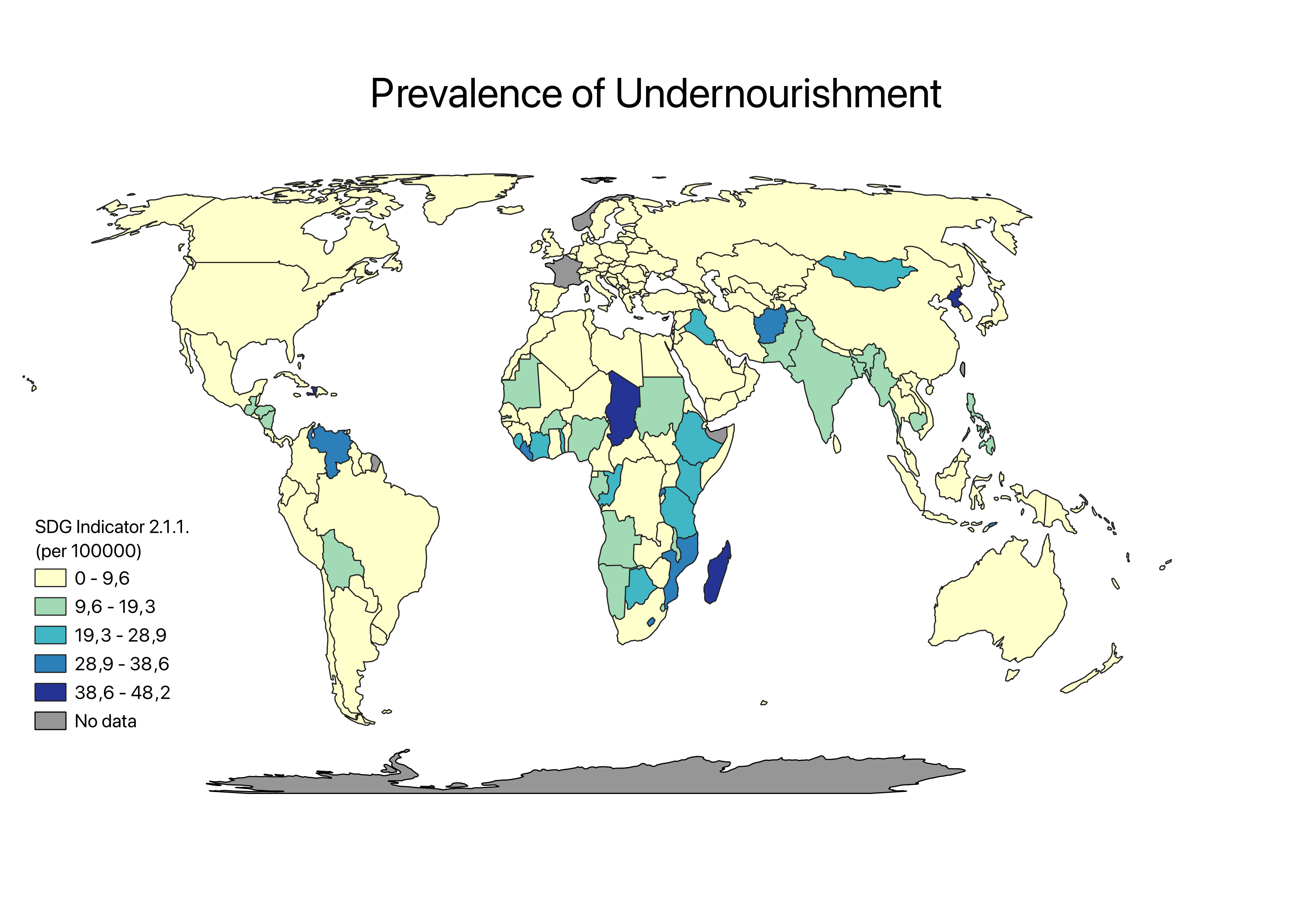
Using SDG 2.2.1., I have made both a choropleth map with QGIS and a map with Esri Online. This SDG analyses the prevalence of undernourishment on a global scale. It could be argued that the dataset has flaws due to the large number of countries qualifying for the lowest category of undernourishment, even though different research suggests otherwise. Overall, undernourishment is mostly prevalent in countries surrounding the equator. Surprising is the missing data from France and Norway. I tried to improve this QGIS map after reading the feedback I got. Nevertheless, the part 'Item properties' was never to be found. Even after restarting QGIS a few times, I could not find it. I would enhance my first map by changing the intervals (0-10, 10,1-20 etc.) and by switching the title of the map with the title of the legend. The Esri online map was supposed to compare SDG 2.1.1. with SDG 11.1.1. (of which I also made a QGIS map, but I ran into the same problem as previously described), but this did not work out. Therefore, I present an Esri Online map containing SDG 2.1.1. with a slider (I discussed this with Britta, and it was fine to upload this one instead).
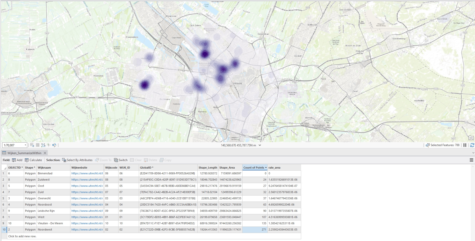
In this assignment, I was supposed to perform multiple analysis with the use of the ‘Bomenkaart Utrecht’. For instance, the prevalence of a specific tree species throughout Utrecht, the number of trees per neighborhood and the Kernel Density Estimation (KDE: estimates the probability density function of a random variable). This graph shows the KDE of the Cherry Tree in Utrecht. I chose for this color scheme because the color is easily visible against the background, which increases clarity. The darker areas represent regions with a higher concentration of cherry trees, and lighter areas show a lower concentration (see legend for exact values). ‘Noordwest’ has significantly less Cherry trees, and ‘Binnenstad’ and ‘Zuidwest’ have higher counts. The lower quantity of this tree could be attributed to residential or commercial zones with fewer green spaces.
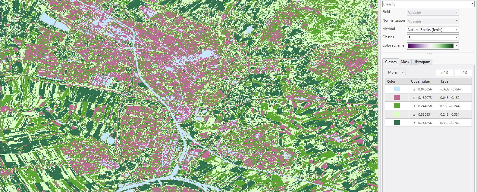
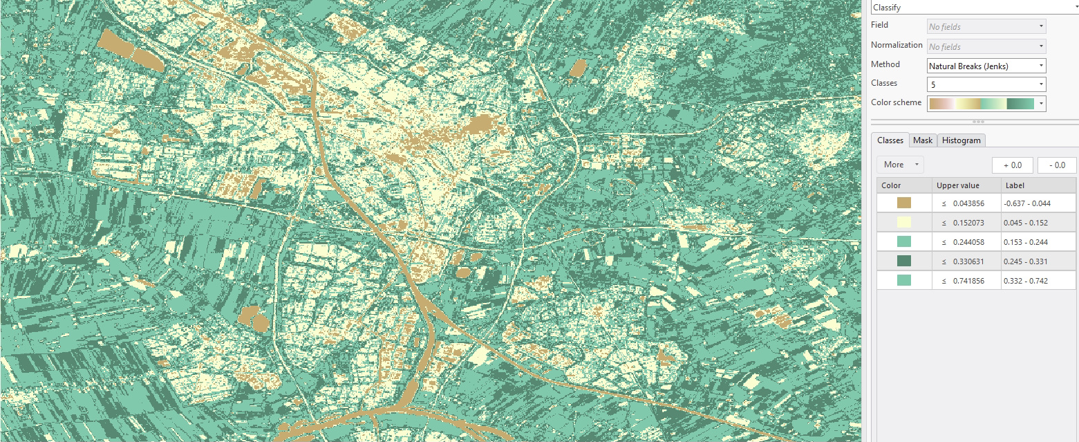
This assignment was mostly centered around performing different classification methods, namely unsupervised pixel-based classification, unsupervised object-based classification, and supervised pixel-classification. First, I selected a preferred area on GEE and consequently, I performed the different analyses in ArcGIS using the image classification option in the classification wizard. These graphs show the supervised pixel-based classification of the NDVI. The different colors represent different NDVI ranges (different vegetation covers). In the first graph (my preferred choice), light blue shows the lowest vegetation cover, and dark green the highest values for this variable. Key observations include the presence of light blue areas mostly in urban and non-vegetated places, pink and light green areas (varying levels of vegetation), represent possible grasslands, and cultivated fields, and lastly dark green highlights regions with dense and healthy vegetation growth, such as forests, and intensively farmed agricultural land. So, the NDVI present in this map shows the urban planning of Utrecht.
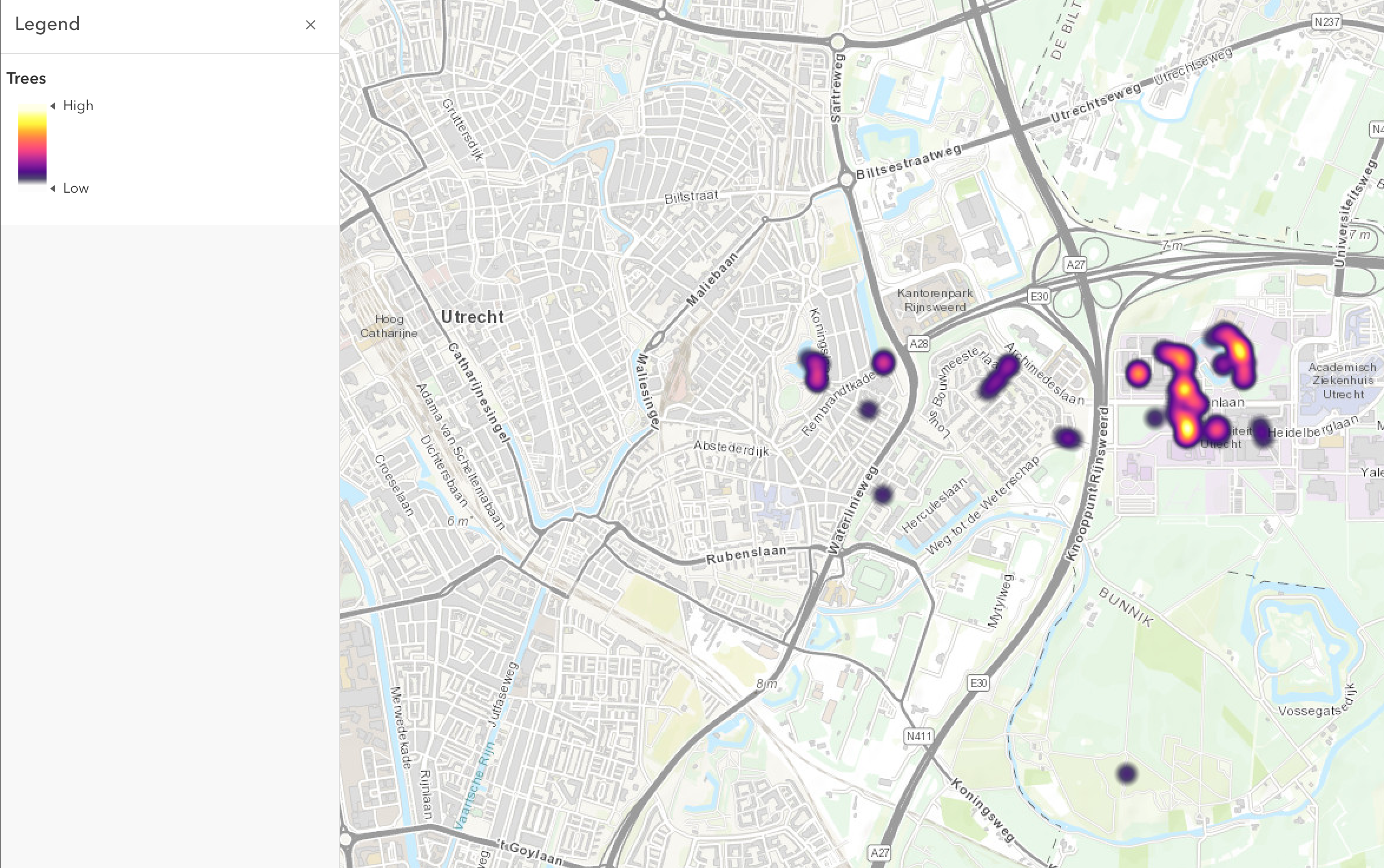
For this assignment, the class was split up in groups, each creating and designing their own survey and relating map. Even though creating the survey, and the data collection part was most important in this exercise, I made a quick map showing the distribution of our data collection points through Utrecht. It becomes clear that these points are mainly located in Science park near Buys Ballot building and the Main Street called ‘Heidelberglaan’. However, this map does not show the actual responses of the audience (how they perceive the tree). Therefore, this map would not be an important addition to further research on our topic, but it does give a nice representation of the location of the data collection points. However, this data would be useful if we were to look at how each individual tree is perceived by the audience. Then, we could pinpoint the locations with the ‘happiest trees’, and suggest placing benches in those places.
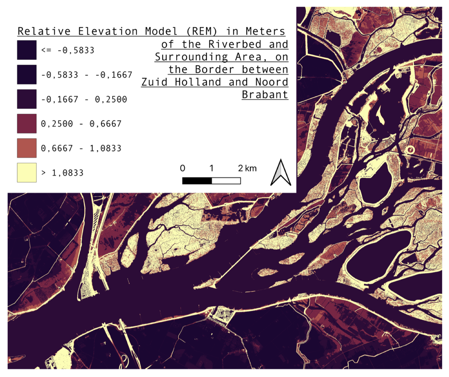
In the fifth assignment, I was supposed to make a map of the REM of a location in the Netherlands using QGIS. I chose to do a location on the border between Zuid Holland and Noord Brabant in a former estuary. Therefore, I used data from GeoTiles which I uploaded into QGIS. Consequently, I made use of the raster calculator to perform the analysis. In contrast to the locations chosen by classmates, my map does not show a gradient from higher to lower elevation, but instead a harder transition (colors do not really fade into each other). Furthermore, this assignment was centered around customizing a map, so the message is conveyed in a clear way. Hence, I tried multiple color schemes until I found one that suited the goals of the assignment the best.
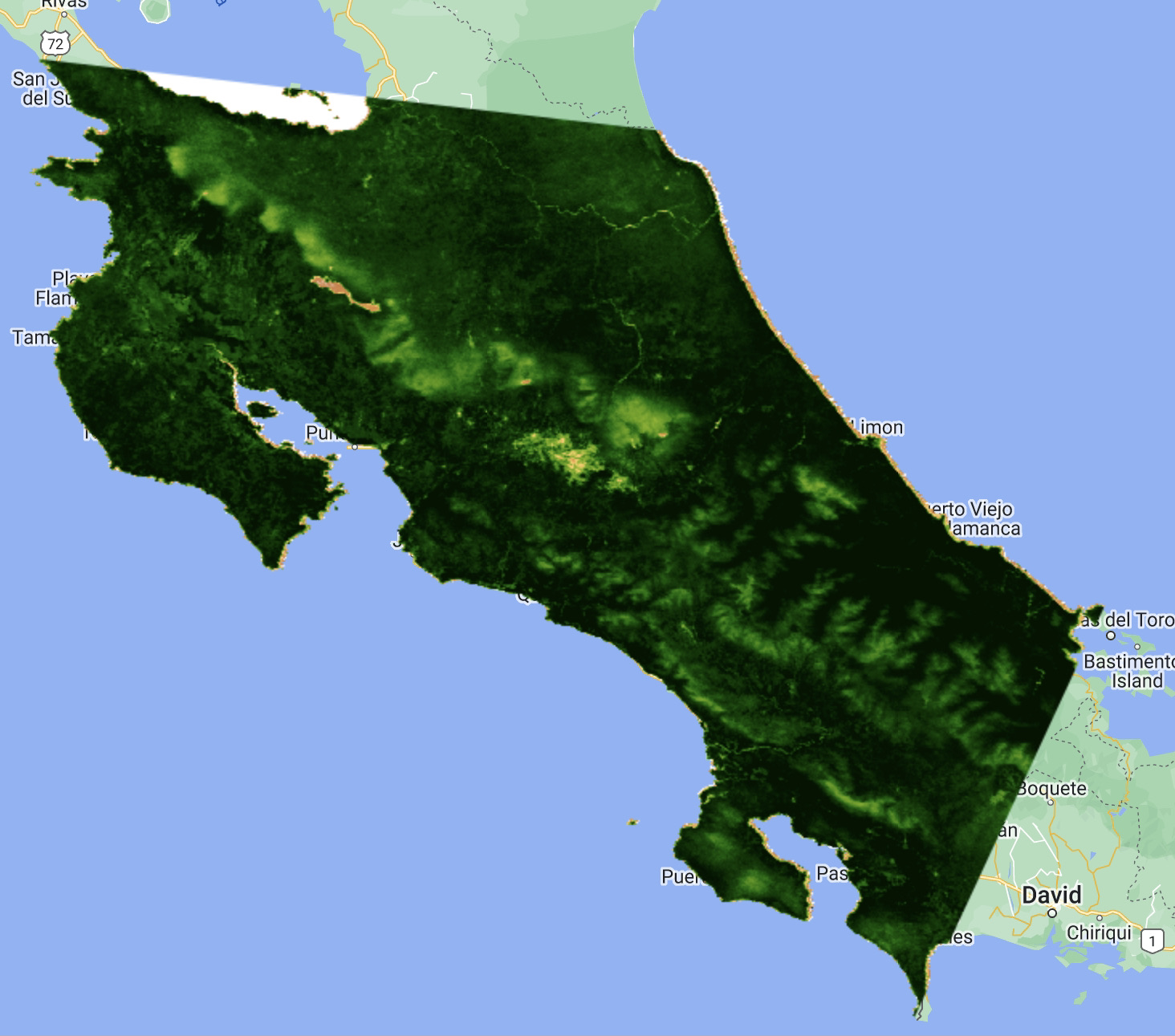
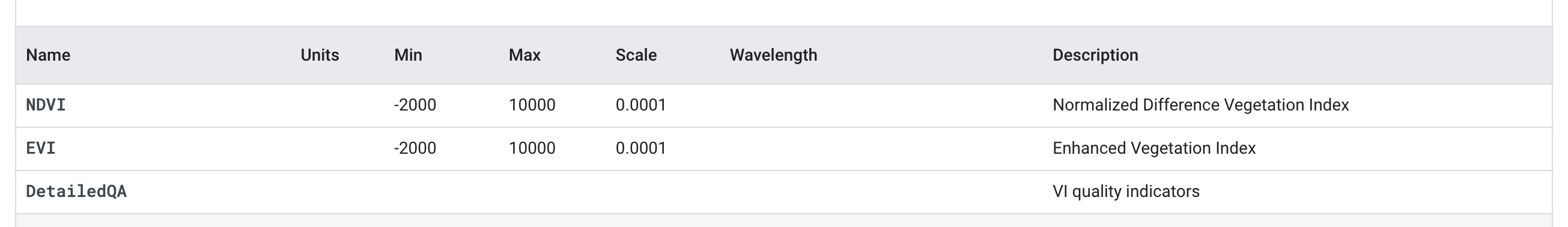
This assignment entailed calculating the Above Ground Carbon Density and GPP of a chosen region. I chose to calculate these variables for Costa Rica, because it lies in the tropics but also has high elevations due to a rugged central massif. Therefore, there is great variation is vegetation throughout the country. Since I fell ill the day we were supposed to do this exercise, I struggled quite a bit and was not fully able to do the exercise in the manner that was written in the assignment instructions. However, I did want to make a map for this assignment, so I endeavored to make a map of the NDVI, EVI and DetailedQA of Costa Rica. This map shows the Above Ground Carbon Density. Dark green represents a high value for NDVI, and light green low values. This makes sense because the tropical rainforests are located on the spots with the darkest greens and the mountain ridge in the area with the lightest greens (diagonal, from north to south). Personally, I would recommend setting up conservation projects in regions with dark green colors to ensure high carbon sequestration. There seems to be a problem with the interactive GEE map, yet I can not figure out how to fix this. Therefore, I uploaded a picture of the map I made (that being said, the legend is therefore missing, but it is similar to how it is described above.).
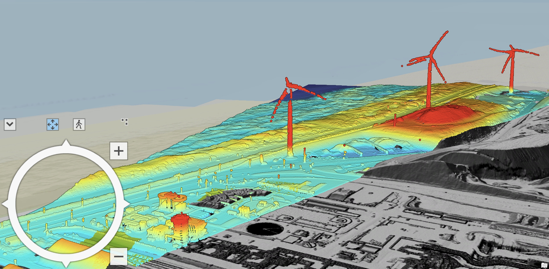
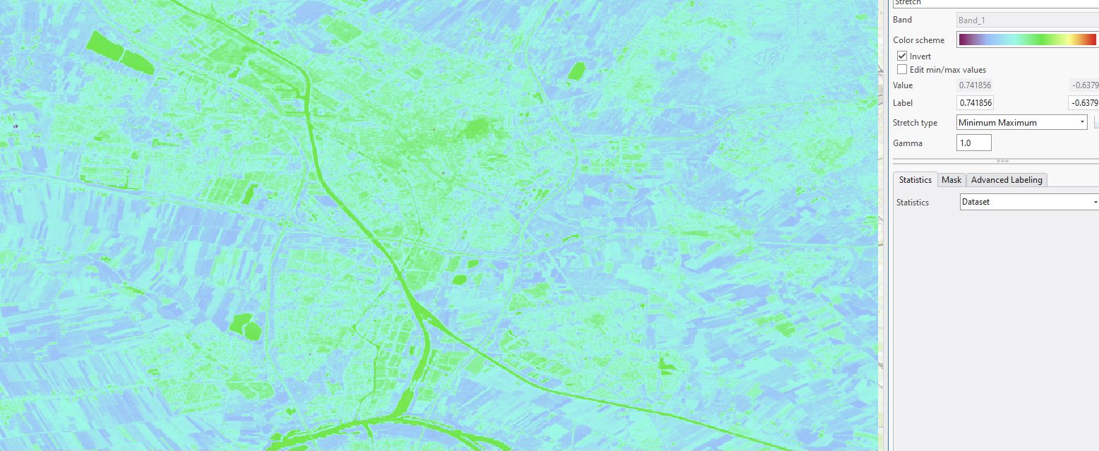
In the last assignment, I needed to use LIDAR data to make a 3D map. For this exercise, I chose for a location near the beach of IJmuiden. Among other exercises, I was supposed to calculate the elevation differences in this area. However, due to the fact that the Netherlands is a flat country (especially in the northeastern part), and we chose a region close to the beach, there are near to no differences in elevation levels (except for a few windmills). In the map, blue represents low elevations, and red high elevations. It is visible that the map is mainly turquoise, meaning that the area is rather low-lying and similar in elevation. I struggle as well to put the map onto Esri Online, therefore I decided to use a screenshot instead.
Hello everyone, my name is Sophie Gort, and I am very pleased to show my website. I am 19 years old and from Utrecht, the Netherlands, where I have lived my whole life. Ever since I was young, I have been very interested in nature and everything related to it. Therefore, I have decided to major in Earth and Environment and biology at UCU. In these past few years, I have seen the beginning effects of climate change starting to change my surrounding. Therefore, I am determined to help us move towards a solution. Hence, I am doing politics as a minor to be able to pursue this after my studies with sustainability as my main focus. Before taking this course, I had no knowledge of working with GIS and programming. Therefore, I am very grateful that I have had the opportunity to get acquainted with this type of study. I am certain it will be very useful for future courses, for example.
If there are any questions or comments about the maps or written text on this website please contact the author via a preferred way below.